
 The sodomite gateway to the illumination with the dark light of Lucifer is signaled in so many clever ways. A spell is cast over the world through these seemingly innocent but very evil symbols. Here's more decoded examples with combinations of elements introduced in previous posts.
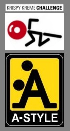
  The Krispy Kreme brand was enormously popular when I lived near Sacramento during the 90s. I don't recall seeing the white on red double K logo but apparently it's been featured along with the familiar stylized wordmark for many years. The double K pictures a scene at the palace, with a pair of Royals (Part 17) engaging in ritual sodomy. The logo designed for the Krispy Kreme Challenge (the company's annual charity race) provides us with a key to interpreting their brand imagery.
 A donut represents the head of a stick figure person. Isn't that what we're being shown? Apply this to the double K and the donuts dotting the Ks are the heads of victims being sodomized by the Royals.
 Remember the Kudawara Pharmacy and A-Style brands with their stick figure head-dot victims? The Krispy Kreme Challenge logo pictures the victim on his hands and knees, held by the neck or shoulders while being sodomized. The gloss reflection suggests third eye illumination and the flashes of white seen during ritual sodomy.
 The illuminated folks at Krispy Kreme obviously share something special in common with Dr John Dee, who served the Royals in England (Queen Elizabeth I). Dee's donut-head stick figure should be pretty familiar by now.
 Is the double K a tribute to the double 0 7? It's certainly giving the Royals something to smile about, representing triple-helix DNA white light bodies with illuminated "crown" chakras.
 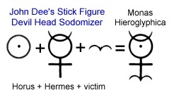 The white on red signals the divine illuminated Adam-kind, with “Adam” meaning “red” or “red earth.”
“The belief in the occult world is if you could sodomize God, you’d get God’s power. You become as gods through sodomy;"
Deprogrammer Interview with Marion Knox: In the House of the Strongman, Sodomy is the Key
Deprogrammer Interview with Marion Knox: In the House of the Strongman, Sodomy is the Key
The Monas Hieroglyphica presents Horus and Hermes as the sodomizers. In the Krispy Kreme variant, Horus is the one being sodomized. The double K ritual sodomy figures illustrate how to own Horus and aquire his power, which the Royals have done and continue to do.
Those Krispy Kreme folks know the slang meaning for donut ("In a prison setting, it is another inmate's anus.”) and the slang meaning of Kreme (semen). Their major competition does too!
In Part 19
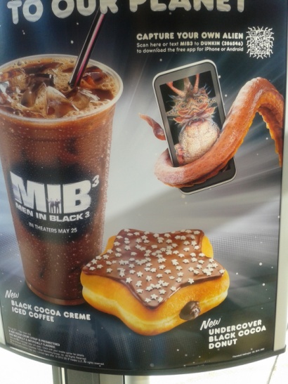 I featured Dunkin' Donuts and their MIB3 promotion, with the Undercover (think “between the sheets,” and covert, occulted) Black Cocoa Donut and Black Cocoa Creme Iced Coffee. Since I haven't addressed their logo before, I'll present it here.
  UPDATE: Since learning about the secret signs of goddess worship, I note that the Krispy Kreme and Dunkin' Donut brands both fly her banner high.
 Krispy Kreme's dominant color is the goddess red. The letter K is the 11th letter, so the featured KK presents an 11 11, which is the goddess pillar ideogram and a signaling of the fertile womb of the goddess. Each K presents a cross, a form with three lines intersecting. Placing them inside the oval (feminine - yonic shape) makes this image the union of the X and O, believed to establish the celestial throne of the goddess.
As for Duncan Donuts, the goddess is signaled through their Double D branding. Yes, that's a bra cup size for very large breasts, and they do put the DD on their cups - but there's more to it than just that. According to the Occultist's interpretation of the 47th Problem of Euclid, the union of Osiris and Isis that produces Horus is represented in the numbers 3, 4 and 5. The number 4 identifies Isis, the goddess. The 47th problem of Euclid involves the area of a square, and for Isis, this involves the side of 4 units in length. The numberings associated with Isis are the base 4, 42, 4x4, 4 and 4, 16 and even 44. With gematria and letter substitution, D and W and double D and double WW (when Z=1) are also used to signal the goddess.
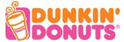 The double D brand looks like a double Dee brand, as in John Dee. The pinkish purple rounded rectangle form that is the setting for the cup of coffee should be a familiar symbol of the sodomite gateway. What looks like steamy vapor rising from hot coffee compares to the curly hairs in the Wheel of Fortune imagery (from Part 40). When you see the cup of coffee as the cornucopia of Masonic imagery (which represents the alimentary tract that everyone wants to own towards the goal of acquiring everything one might want - Part 9), well, you're seeing what's really there.
  Any kind of appeal the name Dunkin' Donuts might have had is lost in the light of an awareness of the esoteric meaning.
 The occult branding of Krispy Kreme and Dunkin' Donuts has nothing on Muscle Milk. Strange bottle, isn't it? Brown bottom. Brown phallic top. Connect the dots. Brown circle, ringed by stars. Yes, that muscle would be a sphincter, and the milk, well, yeah. "Drink. Evolve." Really? Uh - No Thanks!
Ritual sodomy evolves Adam-kind as a precursor to the mark of the Beast. It's the key to the serpent's age-old hijacking scheme, until the age-ending hookup finally arrives.
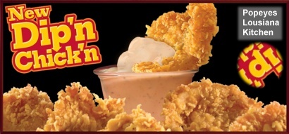 Popeyes Introduces Dip'n Chick'n to present us with yet another food related promotion of ritual sodomy. Whether you're dunkin' donuts in coffee or dip'n chick'n in Popeye's special “Blackened Ranch Dipping Sauce,” you can't escape the offensive imagery. The descender of the letter "p" is an arrow. Arrow = Phallus. P for Phallic Package. Here at the right side of their ad you see a copy I added, rotated into a more easily recognized alignment. The phallus points to the stylized letter “c,” which is a squared circle, a symbol of ritual sodomy. So is the other letter “C.” The square dot over the 2 letters “i” are also squared circles.
  Popeye, aka Harmerty, Horus "who rules with two eyes." Is it just me, or does his jaw and chin always look like a butt? The cartoon character Popeye first appeared in 1929. Popeye was picked up in 1933 by Fleischer Studios and made into a series of Popeye the Sailor theatrical cartoon shorts. If that studio name sounds familiar, this was the studio responsible for “Bimbo's Initiation” (See Part 18). Popeye was known for saying, “I am what I am.” Hmmmmm. Was that him in the burning bush on Mt. Horeb when Moses was commissioned?
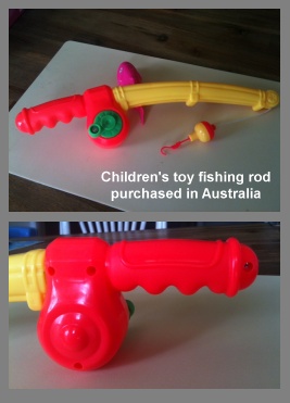 The yellow on red colors of the Popeye's Dip'n Chick'n promotion represent the yellow (Coldplay - Part 38) star light on red, or star/angel on (as in a superior position sexually) Adam-kind.
 While we're on the subject of disquised yellow and red phallic packages, a friend in Australia sent me some photos of a toy fishing rod his wife had bought for one of their young boys. My friend was horrified when he recognized what his son was playing with, and quickly addressed the situation. This toy was not purchased from an “adult” toy store but from a regular store. It was innocently packaged and labeled for children. Examining it with an informed and wary eye it can hardly be mistaken for anything other than what it looks like. What do you suppose is being promoted with this object by targeting little boys? It must surely be marketed with a cloaking spell.
The worshipers of Horus have been actively recruiting you and I from even before birth. I'm so grateful the Lord Y'shua is able to save to the uttermost and that He is so generous with us today. I pray your eyes are being opened to the reality of our world to see with the Lord's own eyes. It matters.
KK=11:11
ReplyDelete